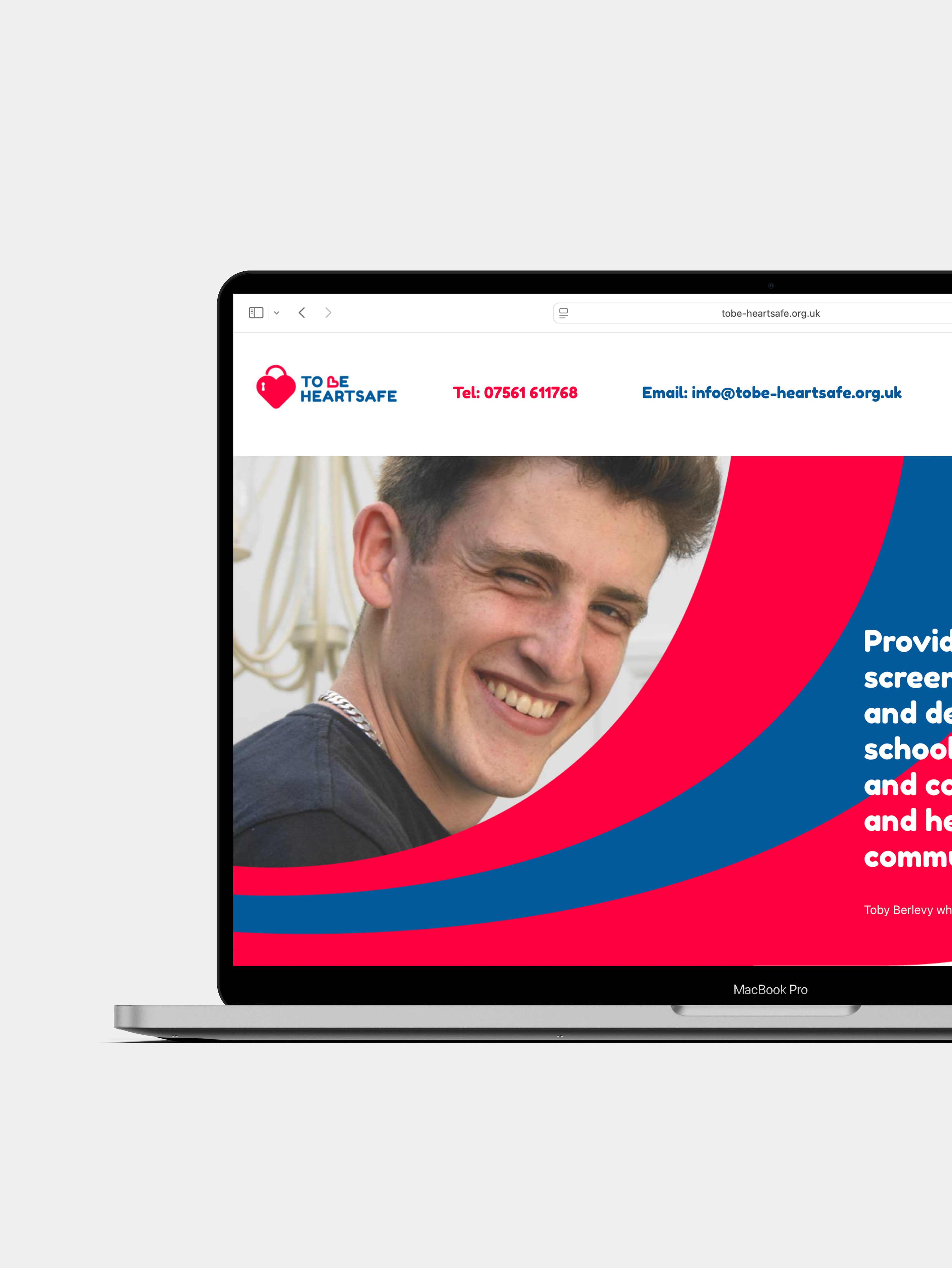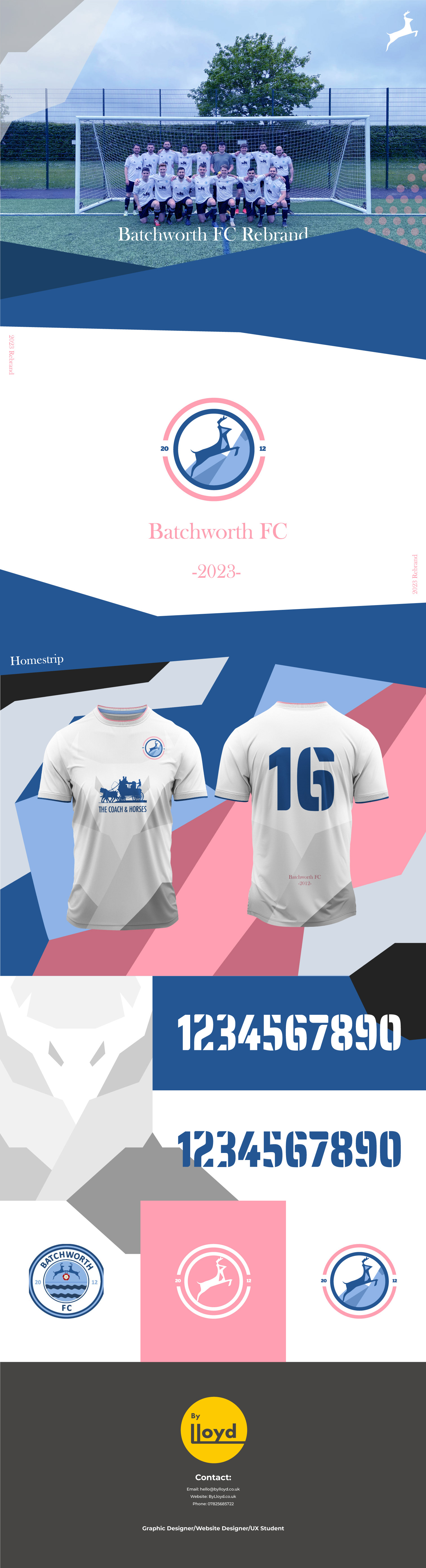

Personal Project – 2023 As a passion project, I undertook a full rebrand of my local Sunday league football team, Batchworth FC, based in Hertfordshire and competing in the Watford Sunday Divisions. The goal was to create a cohesive and modern identity that reflected both the spirit of the team and the geographical roots of the area. At the core of the redesign is the Hertfordshire stag — an emblem deeply tied to the county's heritage and landscape. The dynamic pose of the stag evokes a sense of strength, movement, and determination, mirroring the rugged terrain and hilly surroundings that define the local area. The palette uses bold yet balanced blues to communicate trust, loyalty, and resilience — key traits of grassroots football culture — while soft pink accents bring a fresh, contemporary contrast, adding approachability and visual distinction. The typography is clean and traditional, anchoring the brand in its community roots while allowing room for modern flair. The circular badge system reflects unity and inclusion, common themes in amateur football, and the split date “2012” subtly references the club's founding year, creating a sense of continuity. This design blends local symbolism with minimal geometry and color balance to produce a clean, scalable mark — suitable across digital and physical applications such as kits, social media, and merchandise.